
LUM
THE CLIENT
LUM is a concept for a contemporary skin studio that embraces the belief that skincare should be simple, welcoming, and unpretentious — a calming space that feels like home.
THE BRIEF
The aim was to craft a brand identity that felt timeless, comfortably familiar, and refreshingly clean in its simplicity.

THE SOLUTION
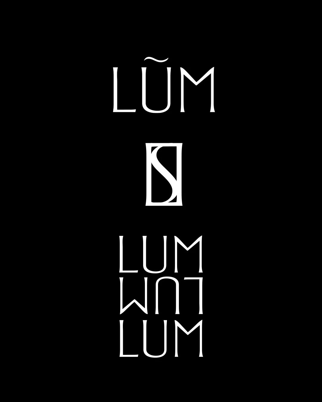
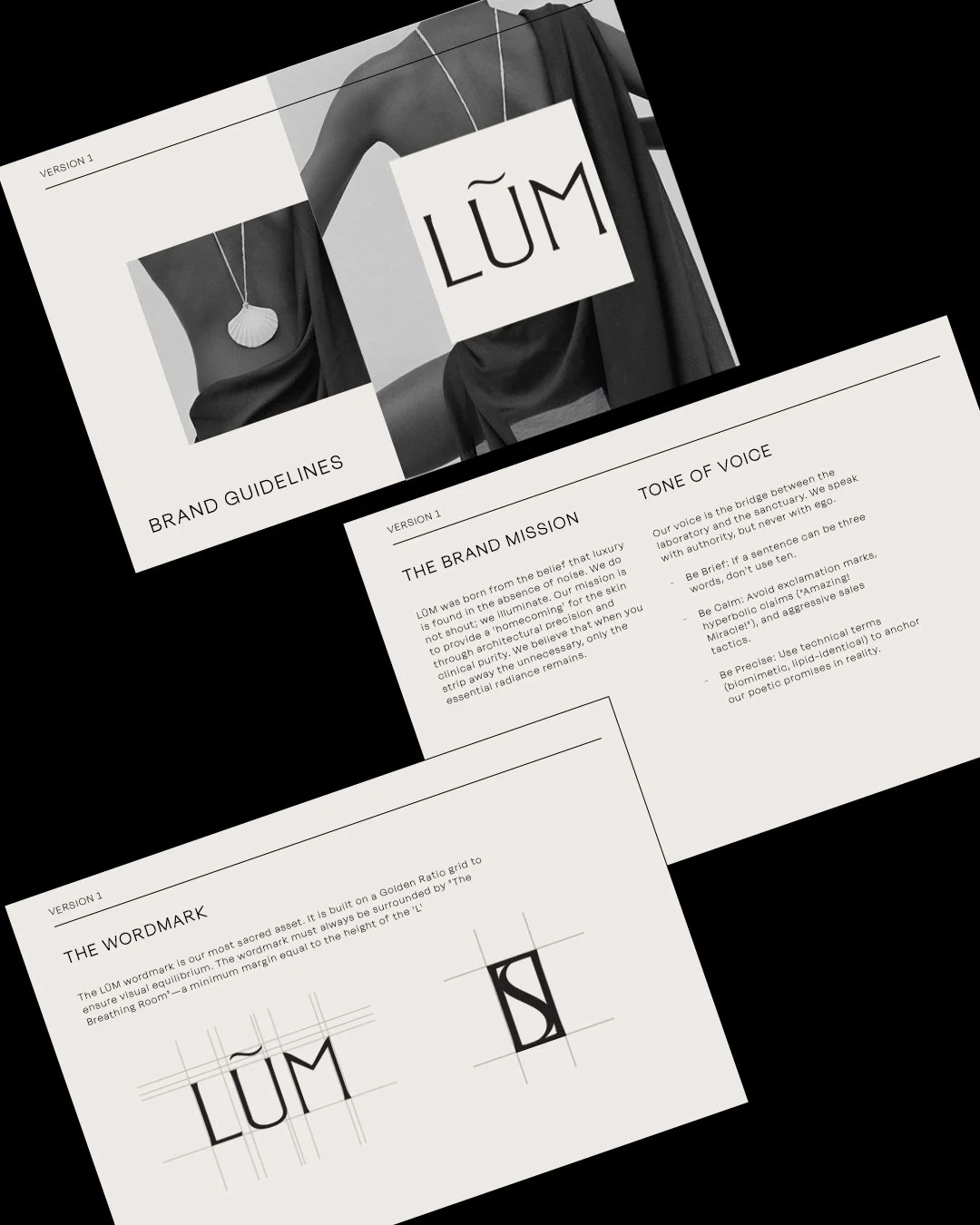
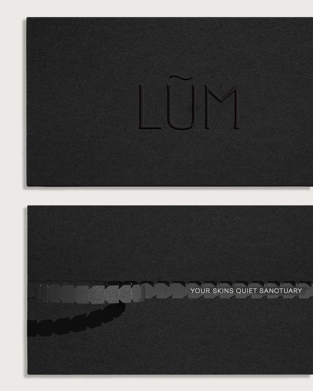
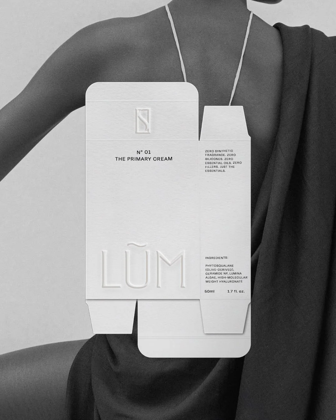
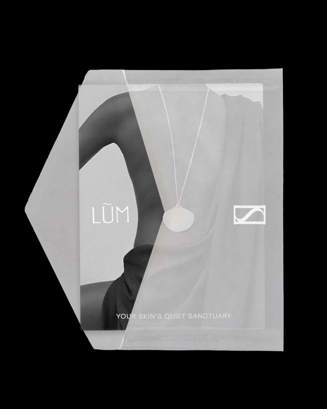
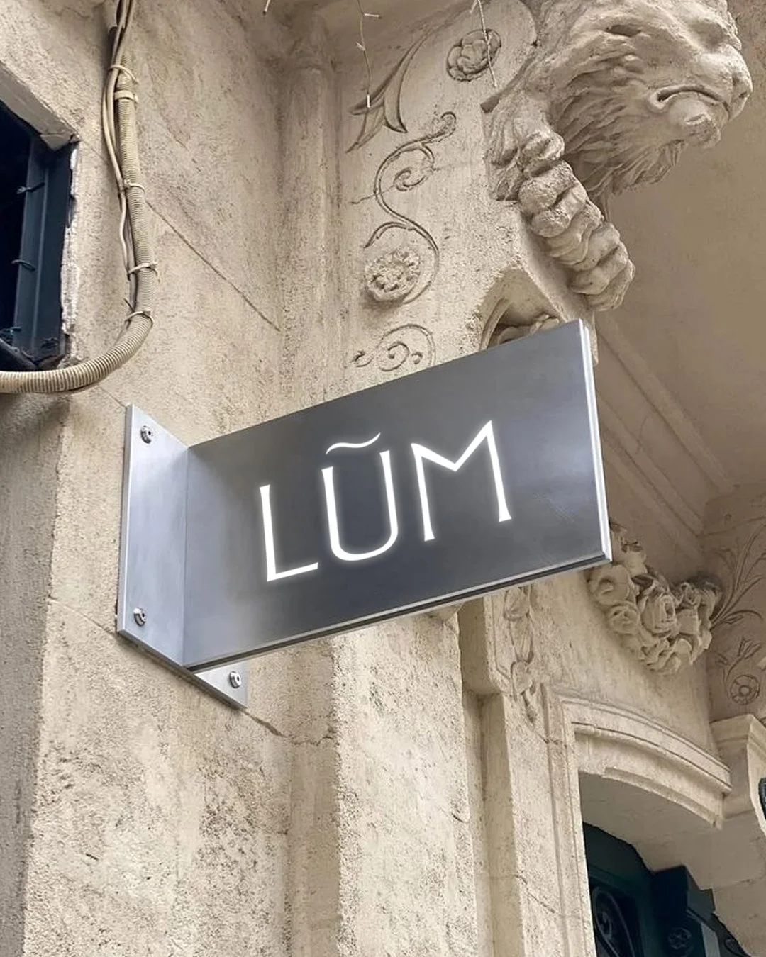
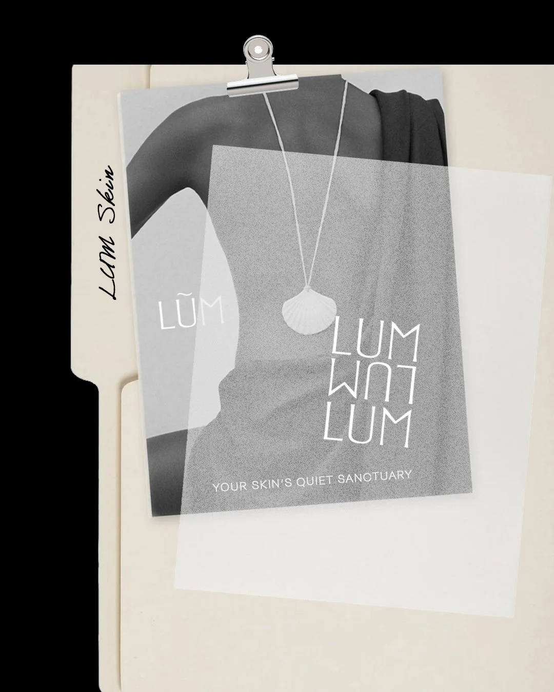
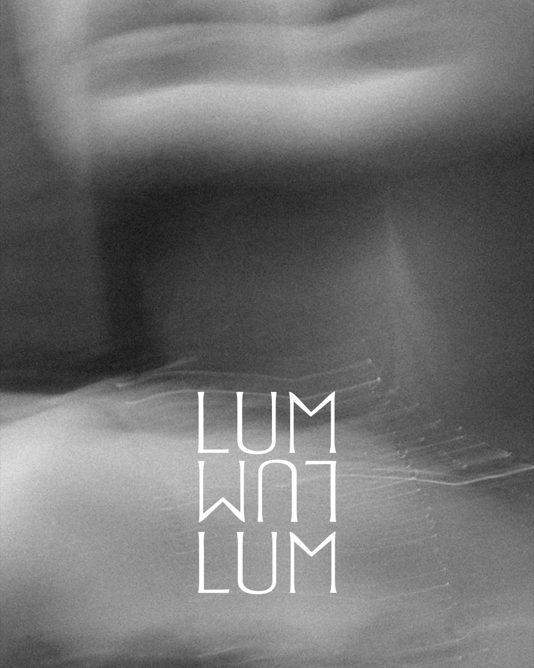
The identity has a primary and secondary logo plus a key word-mark. The wordmark’s boxed shape suggests a sanctuary. Marketing materials, signage and packaging are designed to work together, presenting a clean, cohesive brand feel.
Two logos and a boxed wordmark form the identity. The boxed wordmark feels calm and sheltered. All touch-points—marketing, signage and packaging share a clean, consistent style.